So luckily I happen to know a lot about tattoos. I have tattoos, I like them, and I spend a lot of time looking at them. For this exercise I need to design a tattoo “based on the word ‘Mum’ “. I didn’t want to mess around with this and try a really loose interpretation. People getting tattooed tend to have a pretty good idea of what they want, and when it’s phrased ” the word Mum”, I’m assuming they want a textual element with “Mum” written.
When thinking about style, this one was really easy for me. I suppose firstly I should mention that if someone really was considering getting a tattoo, I highly, highly recommend getting their tattoo artist to design the tattoo. This is nearly always included in the price, and the artist will have the best understanding themselves of what works for their particular style of tattooing and more general tattoo principles. But putting that aside, if by some strange twist of fate I end up making a series of life choices resulting in me becoming a tattoo artist, I’m pretty certain I will focus on traditional tattoos. I like getting traditional tattoos myself, and they last the longest, have a rich history, and never go out of style.
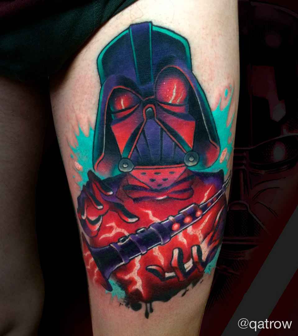
For the uninitiated, when I say traditional tattoos, I’m talking about a particular aesthetic style. It refers to a certain kind of Western/American style that utilises bold outlines and limited colours, featuring recurring motifs like roses, eagles and anchors. One of the most famous and influential artists to practise traditional tattooing was Sailor Jerry (1911-1973). His work fairly encapsulates what is meant by traditional, and was instrumental in the development of many aspects of tattoo subculture, including flash. He even helped to develop many popular pigments and sterilization practises, and was one of the first to work with single-use needles.

I like this style for its visual quality, which is very unique to tattooing. I love the limited palette, the reds and yellows. I think it intelligently works within the confines of the medium, producing artwork with a great degree of longevity. I also love its storied history and the ability to be part of a shared culture. The bold outlines and solid colours produce something really distinct. As the old tattoo adage goes, bold holds!
Just to pay lip service to other styles and demonstrate I’ve done my research here, there are plenty of other styles in tattooing including New School, neo-traditional, blackwork, geometric and sacred geometry, portraiture and realistic, dotwork, handpoked, watercolour, Japanese, many unique cultural styles originating in South and East Asia, Micronesia and the Pacific Islands, and countless others. There really is too much to go through, but just to detail a few…
New School takes some of the sensibilities of traditional or “old school” tattooing, but attempts to modernise it. Typically we see more complex shading, very bright and unusual colours, frequent pop culture reference, and liberal use of caricature and visual distortion.
There are also styles that emphasise realism, with very complex shading and skillfully diluting the ink when applying the tattoos. These styles do tend to have issues with longevity, but nonetheless some beautiful results can be achieved.

There are also innumerable cultural and niche styles. Particularly with various ethnic and cultural styles, I am not one bit qualified to attempt to emulate any of them, so I will happily steer clear!
But back to my chosen style, I looked through the galleries of many of my favourite local and international artists in search of inspiration. list them.
I decided to take heavy inspiration from Jessi Preston. What strikes me about Jessi is her use of the human figure in her artwork. It clearly takes heavy inspiration from and works specifically within traditional tattoo sensibilities, but there’s something very fresh and intriguing about the postures and positions she chooses to impart symbolism into her work. I decided on using a mother-and-baby motif, and wanted to base it on Jessi’s use of form.
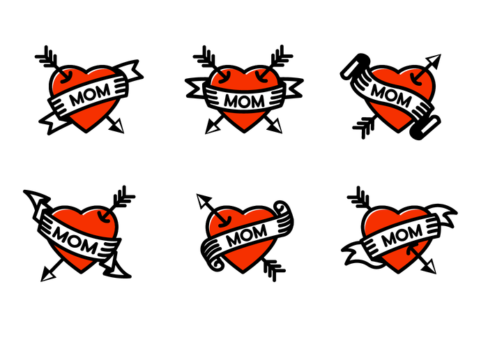
For tying the whole piece together, I decided on the classic “MOM” tattoo. Part of the culture of traditional tattoos is utilising recurring themes and images, but imparting your own spin.

In general traditional tattoos tend to scale up or down pretty well, due to the thick lines and solid colours. Like all tattoos they really shouldn’t be made too small or the poor aging of the tattoo will become a factor. I started working on designs and fairly quickly settled on one that I really liked.


I drew up my design on cardstock. I tried two different variations and colour combinations. In both I kept true to traditional tattoo palette limits.

I thought they were both pretty successful but I preferred the one on the right personally. Finally I needed to draw up the design at a larger scale. For this I decided to do it digitally again. A lot of tattoo artists I follow now use digital for drawing up their stencils, and if it needed to be printed on a card as well, I figured digital was my best bet.


I’m really happy with the final image, I think it looks very consistent with the style of tattoos that I love.
