I took a long break over Christmas but I’m back and ready to get back to work.
I received lots of helpful feedback in my report for part 4. As always I was shown a lot of questions about my exercises that seem very obvious in hindsight but weren’t explored at the time!
Also helpful was pointing out what areas seemed useful to me personally to expand on and return to in future exercises, for example the methodology applied in the visual distortion exercise, and the simple line drawings.
I think in general I need to be more consistent and methodical with my research, and apply a good level of work ethic and commitment to every exercise. I think sometimes I can focus too much on what I want to do and not what the course is asking me.
As an artist I think it’s pretty clear that I favour the drawing elements over the design elements. I don’t see this changing in the future but I do think I can bring a greater balance, and spend some time researching good design. In the final part of the course hopefully I can work on and improve my skills as a designer.
My ability to embrace new things and do secondary research was praised, so I’ll aim to continue with that in the future, but special emphasis on design elements and being more methodical in my practise.
I struggled a bit with this assignment. To be honest I’ve usually found still lifes boring, but I know it’s an area I need to work on in order to improve as an artist so I was eager to tackle the assignment.
I spent some time thinking about what theme to choose. I found them all a bit challenging. In the end I chose discovery. I’ve been watching a lot of re-runs of the reality TV show Survivor recently and I guess the props from that show influenced my decision. I came up with doing a still life with some objects like a key, a compass, a map… hopefully all of these would coalesce into the theme.
I collected items that I could find that I felt appropriate and started playing with composition. The process I used was the same from the exercise on viewpoints, but I allowed myself to move around the objects as I went, searching for an effective layout.
The items I ended up with were a key, a pocket watch that I was going to pretend to be a compass, a small lantern, a glass bottle with a message inside, and a decorative shell. I decided I could draw in a map at the base afterwards.
I tried a few thumbnail sketches to try and get an even better sense of what composition would work.
Next, working at A3, I did a detailed drawing of my setup.
The perspective is off in places and I’m not 100% sure about the composition I settled on. Although I do think there is potential in the items that I’ve collected, I think they adhere to the theme pretty well.
I think the way the items build toward the theme is pretty compelling. The key in the foreground I think is best suited to be the centerpiece of the arrangement.
I didn’t have my scanner or printer handy, so I just tried to copy my sketch as best I could and prepare to do a tonal version. I wasn’t quite sure what I needed to do here, but I thought to get a good representation of tone, I would just use one colour of paint and try to recreate the still life.
Throughout all of these exercises I tried to keep my representations relatively loose and allow myself to get a little messy with it. I liked the idea of “discovering” the meaning of the illustration, first through an expressive representation and then through piecing together the meaning of the objects. I think the tonal version is pretty interesting but I was looking forward to developing it further.
Next I needed to create a line visual to set the basis for my finished piece.
I used a dip pen on cold press paper to do the line drawing. I think after a few iterations I was getting a better sense of how to subtly move the objects to make a better composition. I think the introduction of the map really helps to tie the whole image together.
I decided to finish the piece with watercolours. I felt like they’re a very naturally expressive medium and complement ink line drawings very nicely. They also contribute to what I’m going for, of moving the image slightly towards abstraction to encourage the viewer to kind of search for the meaning. I thought the lines would help to keep the drawing representative and keep the items distinguishable.
I’m not in love with the result. I think overall the colour choices are pretty poor. Everything kind blends into very neutral colours. This is why I have trouble with still lifes in watercolour in general.
I thought that rather than leave the assignment on a bum note, I would have another go at producing a finished illustration.
I decided to work digitally and experiment with a style that I’ve worked a little bit with in the past.
I found this video very interesting, the second portrait really. I notice in my own work as I work towards developing a unique style, I tend to really like harsh angles, straight lines and distinct geometry. I wanted to try and do my still life in this style. I thought that it would be a more faithful exploration of trying to develop a personal style and doing something a little interesting and unique.
The idea is to digitally paint using only the geometric selection tool. You build up different layers of shapes using different blending modes. The shapes don’t necessarily conform logically to what you’re trying to represent. They just contribute to making something graphic and fun.
I’ve experimented with the style before here, which I did earlier in the year.
Here’s the timeline of my digital illustration.
I started off with a line drawing.
Then I started filling in the colours. The layers that I used were a normal layer, a layer with soft light blending, overlay and one with multiply.
Next I continued to develop the image with colours.
Once I had gotten the image this far, the fun part! I removed the layer with the line art.
The result is something very punchy and fun. I made some finishing touches and played around a little bit with some colour correction.
I really like this piece. I hope that the theme has been successfully conveyed, and that removing linework and representing the entire image with overlapping geometric shapes creates something compelling. I’m glad I decided to keep working after completing the watercolour piece.
I started listing my references and attempting to categorise the different characters into groups.
I brainstormed an original character, deciding roughly on coming up with some kind of adventuring hero.
I had an idea for a kind of wandering mechanic character in one of these fantasy/post-apocalypse worlds.
It was fun to repeat the drawings, as the more I drew her the more personality she ended up with. Initially I thought of a kind of stoic wanderer, but I came around to a more sassy, fun character. Happy with the outline, I made a character sheet.
For my second character I wanted to really go in a totally different direction. I came up with what I thought was a pretty fun idea. I wanted to make a humanoid cow who was also a necromancer, who wanted to take revenge on humans for farming and slaughtering her fellow cows. She reanimates the skeletons of dead cows to make an army to enact her retribution.
It was a lot of fun to brainstorm this character. It was interesting to try and develop the head and how it would move and pull off expressions. For the body I looked at pictures of gorillas to come up with this kind of knuckle-walker thing, which I thought would work well for the character.
I’m really pleased with this one. It’s such a fun idea, and I think it turned out well.
I think this was one of my favourite exercises to research and draw, and I think the end results are pretty good.
I was very excited to do this exercise. Character design is something I’m very interested in and see as a future career path so I wanted to really give this exercise my all.
The first part of the exercise asks me to collect “as many examples as possible of different characters”. Well, I thought “as many as possible” was an ambitious ask so I tried to at least keep the examples loosely from the same reference pool.
For sources I took it as an opportunity to pull from some of my many artbooks I have lying around. When I really enjoy something I often look to see if an artbook is available. I love to see the creative process and design stages of different fantasy worlds. I tried to choose books that represented a variety of styles, but a commonality in theme. I ended up deciding on a loose fantasy/sci-fi/horror coalition.
The first book I looked at was The Art of Ooo, the artbook for the Adventure Time animated series. It’s ostensibly a children’s show full of zany fantasy creatures and environments, but it’s gained mainstream popularity for its adult themes. The setting is a sort of hidden post-apocalyptic landscape, taking place after the cleverly named “Mushroom Wars”. Amidst the goofy anthropomorphic “Candy people” are many eldritch horrors and Lovecraftian demons, and the show has this really charming fusion of cutesy and horror, making it thematically mature but fun and enjoyable for children. I love this approach and it’s something I’d love to work on myself.
Particularly useful are some of the character sheets and guidelines building the visual aesthetic of the world. There are also some early concept sketches showcasing some of the more macabre ideas.
Next I looked at a new book, Creating a Champion, an artbook for the most recent game in The Legend of Zelda game series, Breath of the Wild. The minute I saw the concept art for this game I fell in love with it. The promotional imagery is done digitally but rendered trying to emulate traditional media. They’ve created something really unique and beautiful. Like Adventure Time, the game takes place in a twee fantasy environment, but in the shadow of an apocalyptic war.
The book also features useful character sheets. It features animal-like races and also a sort of steampunk mechanical dimension, at times venturing almost into soft sci-fi.
Usagi Yojimbo is a comics series by Stan Sakai recreating the world of feudal Japan with anthropomorphic animals. The titular hero is a wandering samurai swordsman, and a rabbit. One of the many things I love about this series is the expressive characters, the myriad facial expressions convey such depth of character.
Ultimania Archive is a book for the Final Fantasy series that I’ve brought up before in a previous exercise. Much of the early games were designed by seminal concept artist Yoshitaka Amano, and he helped pioneer an interesting sort of fantasy/sci-fi fusion.
One of my favourite video game series is the Dark Souls franchise. Notoriously challenging, it features a very deep and well-developed game world. The world of Dark Souls is categorised by unsettling, gory fantasy horror characters and locales. It’s disturbing and unsettling, but has such depth and intrigue that it’s hard not to get sucked in. Every character and location contributes to a greater narrative that begs further exploration.
The recent Mad Max: Fury Road is often identified as one of the greatest action films of all time. It’s pure post-apocalypse. The artbook shows some interesting early designs for many of the characters.
Appleseed is a manga series by famed artist Shirow Masamune, famous for his brilliantly inventive and technical mechanical designs.
Hopefully this body of reference material is enough for the “as much as possible” requirement! I think based on the books I looked through, while showcasing many different styles, there is a sort of through-line tying them loosely together. I think I have enough ideas and references to start coming up with my characters for the exercise.
References
Dark Souls: Design Works. (2012) Japan: Kadokawa.
Final Fantasy Ultimania Archive: Volume 1. (2018) USA: Dark Horse.
Masamune, S. (2007) Appleseed: The Promethean Challenge. 3rd ed. USA: Dark Horse.
McDonnell, C. (2014). Adventure Time: The Art of Ooo. London: Titan Books.
Sakai, S. (2014) The Usagi Yojimbo Saga. USA: Dark Horse.
The Art of Mad Max: Fury Road. (2015) London: Titan Books.
The Legend of Zelda: Breath of the Wild. Creating a Champion. (2017) USA: Dark Horse.
This exercise specifically requests that it be tackled with an open mind, something my tutor informed me that I apparently excel at! So I wasn’t too worried about going through the process. Visual distortion is not something I tend to do too much of, but something I’m not afraid to try!
Firstly I was asked to draw a picture of a cat or dog. Well, I have two beautiful cats as co-habitants, so I jumped at the opportunity to draw from life. Especially being an exercise on visual distortion, I felt that drawing from life would help imbue some of the cats’ character into the drawing.
I don’t know if you’ve ever tried to draw a cat from life. You could say they aren’t the most cooperative animals. Eventually one the cats, Hina, curled up and fell asleep on me while I was watching television. I squirmed around a bit and managed to pull out my sketchpad without disturbing her and tried to draw her while she was sitting still for a moment. Well, I wasn’t in a very comfortable position, and I couldn’t hold the sketchpad properly without disrupting her, but I managed to pull off a sketch where everything is more or less in the right place and rendered in a way that feels relatively “real”.
Looking at it now I think it captures her charming little personality surprisingly well. I like the composition and pose, and I love that all four of her cute little white mittens are poking out.
I saw the second part of this exercise as another opportunity to redeem my attempts at distilling client visuals. It also expands on my work on the exercise from earlier in this part, identifying tools and materials. I used a soft felt tip pen to do the five-line drawing. Here’s the result.
I’m actually surprisingly really pleased with it. I think it maintains the character of the original drawing but in a very cutesy style.
___
The next challenge involves collage. Well, I always run into trouble at these parts, partly because honestly I don’t really collect any magazines and the comics and art books that I do collect that represent a substantial strain on my income are definitely not suitable for mutilation. I made a trip out to my mom’s house and she kindly agreed to lend (or sacrifice?) some of her random magazines she had lying about.
I started cutting and pasting, trying not to be tied down to realistic interpretations. I really had no idea what I was doing, but I tried not to let my confusion and uncertainty get to me! One decision I did make purely for the sake of readability was to sort of group colours together in a way that made sense. I still have no idea if it reads as a cat. I’ve been staring at it too long to tell!
Anyway, next I had to render this monstrosity I’ve created. I did a few sketches for fun before doing a finished drawing.
At this stage I was finding the whole process pretty amusing, so I guess that’s good. It was taking a distinctly Pokémon-esque form. Reminding me of this crazy character.
I painted the piece with watercolours to do the colours, giving it more of an abstract edge. I liked the composition of my original sketch but I don’t think it works for this half-cat, half-bird creature. I was looking forward to see how I could develop the character.
Its name? Peacat, obviously.
Finally I had to place this chimeric, Pokémon miscreation in a larger piece. I ran with the idea of introducing a narrative so I came up with this little comic strip.
I think the character of the cat is captured pretty well and hopefully the strip is funny. I think looking back over the whole exercise, I really allowed myself to be brought on a strange unexpected journey and produce something unique and out of my comfort zone. Surprisingly I might even use some of the steps in this exercise in the future, finding it a fun way to produce some weird results.
So luckily I happen to know a lot about tattoos. I have tattoos, I like them, and I spend a lot of time looking at them. For this exercise I need to design a tattoo “based on the word ‘Mum’ “. I didn’t want to mess around with this and try a really loose interpretation. People getting tattooed tend to have a pretty good idea of what they want, and when it’s phrased ” the word Mum”, I’m assuming they want a textual element with “Mum” written.
When thinking about style, this one was really easy for me. I suppose firstly I should mention that if someone really was considering getting a tattoo, I highly, highly recommend getting their tattoo artist to design the tattoo. This is nearly always included in the price, and the artist will have the best understanding themselves of what works for their particular style of tattooing and more general tattoo principles. But putting that aside, if by some strange twist of fate I end up making a series of life choices resulting in me becoming a tattoo artist, I’m pretty certain I will focus on traditional tattoos. I like getting traditional tattoos myself, and they last the longest, have a rich history, and never go out of style.
For the uninitiated, when I say traditional tattoos, I’m talking about a particular aesthetic style. It refers to a certain kind of Western/American style that utilises bold outlines and limited colours, featuring recurring motifs like roses, eagles and anchors. One of the most famous and influential artists to practise traditional tattooing was Sailor Jerry (1911-1973). His work fairly encapsulates what is meant by traditional, and was instrumental in the development of many aspects of tattoo subculture, including flash. He even helped to develop many popular pigments and sterilization practises, and was one of the first to work with single-use needles.
A typical traditional tattoo flash sheet (Sailor Jerry)
I like this style for its visual quality, which is very unique to tattooing. I love the limited palette, the reds and yellows. I think it intelligently works within the confines of the medium, producing artwork with a great degree of longevity. I also love its storied history and the ability to be part of a shared culture. The bold outlines and solid colours produce something really distinct. As the old tattoo adage goes, bold holds!
Just to pay lip service to other styles and demonstrate I’ve done my research here, there are plenty of other styles in tattooing including New School, neo-traditional, blackwork, geometric and sacred geometry, portraiture and realistic, dotwork, handpoked, watercolour, Japanese, many unique cultural styles originating in South and East Asia, Micronesia and the Pacific Islands, and countless others. There really is too much to go through, but just to detail a few…
New School takes some of the sensibilities of traditional or “old school” tattooing, but attempts to modernise it. Typically we see more complex shading, very bright and unusual colours, frequent pop culture reference, and liberal use of caricature and visual distortion.
New School
There are also styles that emphasise realism, with very complex shading and skillfully diluting the ink when applying the tattoos. These styles do tend to have issues with longevity, but nonetheless some beautiful results can be achieved.
There are also innumerable cultural and niche styles. Particularly with various ethnic and cultural styles, I am not one bit qualified to attempt to emulate any of them, so I will happily steer clear!
But back to my chosen style, I looked through the galleries of many of my favourite local and international artists in search of inspiration. list them.
I decided to take heavy inspiration from Jessi Preston. What strikes me about Jessi is her use of the human figure in her artwork. It clearly takes heavy inspiration from and works specifically within traditional tattoo sensibilities, but there’s something very fresh and intriguing about the postures and positions she chooses to impart symbolism into her work. I decided on using a mother-and-baby motif, and wanted to base it on Jessi’s use of form.
A post shared by Jessi Preston (@jessiprestontattoos) on
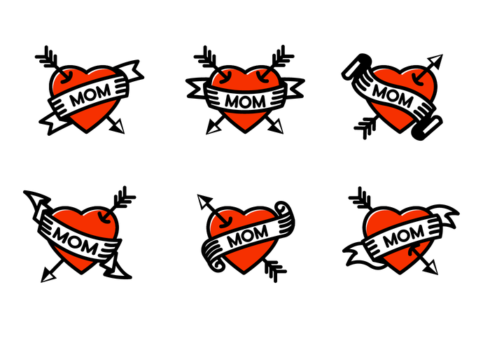
For tying the whole piece together, I decided on the classic “MOM” tattoo. Part of the culture of traditional tattoos is utilising recurring themes and images, but imparting your own spin.
The classic design: heart, arrow and script.A Sailor Jerry flash sheet riffing on the classic design.
In general traditional tattoos tend to scale up or down pretty well, due to the thick lines and solid colours. Like all tattoos they really shouldn’t be made too small or the poor aging of the tattoo will become a factor. I started working on designs and fairly quickly settled on one that I really liked.
I drew up my design on cardstock. I tried two different variations and colour combinations. In both I kept true to traditional tattoo palette limits.
I thought they were both pretty successful but I preferred the one on the right personally. Finally I needed to draw up the design at a larger scale. For this I decided to do it digitally again. A lot of tattoo artists I follow now use digital for drawing up their stencils, and if it needed to be printed on a card as well, I figured digital was my best bet.
I’m really happy with the final image, I think it looks very consistent with the style of tattoos that I love.
This exercise requires me to do an illustration for a chain of high quality seafood restaurants. The brief describes the restaurants as being sophisticated, modern, bright and contemporary, and based in several European cities.
The first port of call was to do some research on existing European seafood restaurants and get a taste for the kinds of menu and logo illustrations already present in the market. I was pretty surprised how difficult it was to find seafood restaurants that actually had logos or menus that featured any illustrations at all. Compounding things further is a real lack of seafood chains in Europe in general. It seems that pan-European restaurant franchises that specialise in seafood is not really a thing. This was a little bit of a relief, because what I expected to find was lots of very simple, modern, almost deconstructed fish logos, but it seems the market is more ripe for experimentation and variety.
I did find a few noteworthy restaurants that did use illustrations. Some used very simple, conventional logo design:
And others used a different approach.
I noticed a lot of restaurants using a kind of simple, handwritten style font. It looks like a trend kind of selling the idea of being very natural, organic and less “corporate”, if that makes sense. It was easy to identify this as a modern trend.
As I thought about the exercise I thought about what would personally appeal to me. The exercise says that food depicted must be “visually appealing”, and what came to my mind was the work of Studio Ghibli, who incidentally craft the most beautiful representations of food in their animated films. This article at boredpanda.com showcases a woman who lovingly recreates some of the meals from Ghibli films, and demonstrates what I mean when I say the studio is great at drawing delicious food!
Here is a fantastic supercut of various Ghibli films and the tasty food within, compiled by video editor Herrozzy.
When I first read the exercise I expected to be doing something very minimal and deconstructed, but actually on doing the market research, it seems like many modern restaurants are embracing a more hand-drawn, natural style of advertising, which came as a relief to me. Those kind of corporate logos with the solid colour vector artwork strikes me as a bit dated, and it looks like the market agrees. I was eager to see what I could cook up.
This vector art seems a little dated to me.
I began by looking for modern, simple dishes that I thought would look good as an illustration. I had an idea what I wanted, and compiled a few different references to come up with this sketch of a grilled sea bass.
I recreated my sketch digitally, trying to keep in mind to keep it very simple and fresh. I took inspiration from the earlier animated images to make something that I thought felt modern, and you might see in a trendy seafood restaurant.
In reconsidering, I felt a bit silly choosing to draw the prepared meal before it had been grilled, feeling like a cold raw fish was not very trendy and appetising! So I returned to it and updated the picture.
Marking in the grill lines I think improves the visual appeal of the image. Of course it was also important to make sure the image holds up at a smaller scale, 40mm x 40mm.
Overall I like the sort of hand-drawn look and think it wouldn’t feel out-of-place on the menu card of a modern seafood restaurant. I think the meal is simple enough to work at a small-scale and detailed enough to work on a large one.
For this exercise I’m making an illustrated cover for a children’s book titled Animals from Around the World.
The age range for this book is intended to be 7-11. Fortunately I have nieces and nephews who exactly represent that range. As supplementary research I decided to conduct an interview with them to ask them what they like to see in illustrated book covers that might motivate them to take it from the library shelf. Here are the interview tapes.
So based on the answers from both kids, it seems like it would be a safe bet to target a more adventurous styling. Danger and mystery were listed as things that would draw them in and want them to pick up a book. It looks like the best animals to showcase would be dangerous animals like leopards and sharks, but also maybe cute animals.
In going about my main body of research for the exercise, I wanted to combine exploring children’s illustrations throughout the years with a reexamination of the works that I personally grew up with. I wanted to get a better grasp on the history of illustration and how styles have changed, and also look at the books that I read as a child through a new lens.
I actually found it relatively difficult to find good meta-analysis of children’s illustration as a historical artistic genre. Even today it seems to be considered a very niche area of visual art, without much academic consideration. For the purposes of the exercise I found it helpful to take individual case studies, contextualise them in the period they were working, and try and infer a working understanding of the stylistic history of children’s illustration.
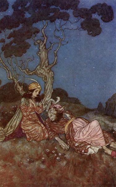
It seems a good place to begin for modern children’s illustrations is in what’s dubbed “The Golden Age”, apparently beginning in the mid 19th century when improved printing technology improved the accessibility of illustrations in mass published literature. Key artists from this period include Edmund Dulac (1882-1953) a French artist who produced many beautiful lithographic illustrations. To me his work reminds me of Art Nouveau illustrator Alphonse Mucha, who’s graphic prints have a similar quality in how the figures are outlined.
Dulac, taken from Beauty and the Beast
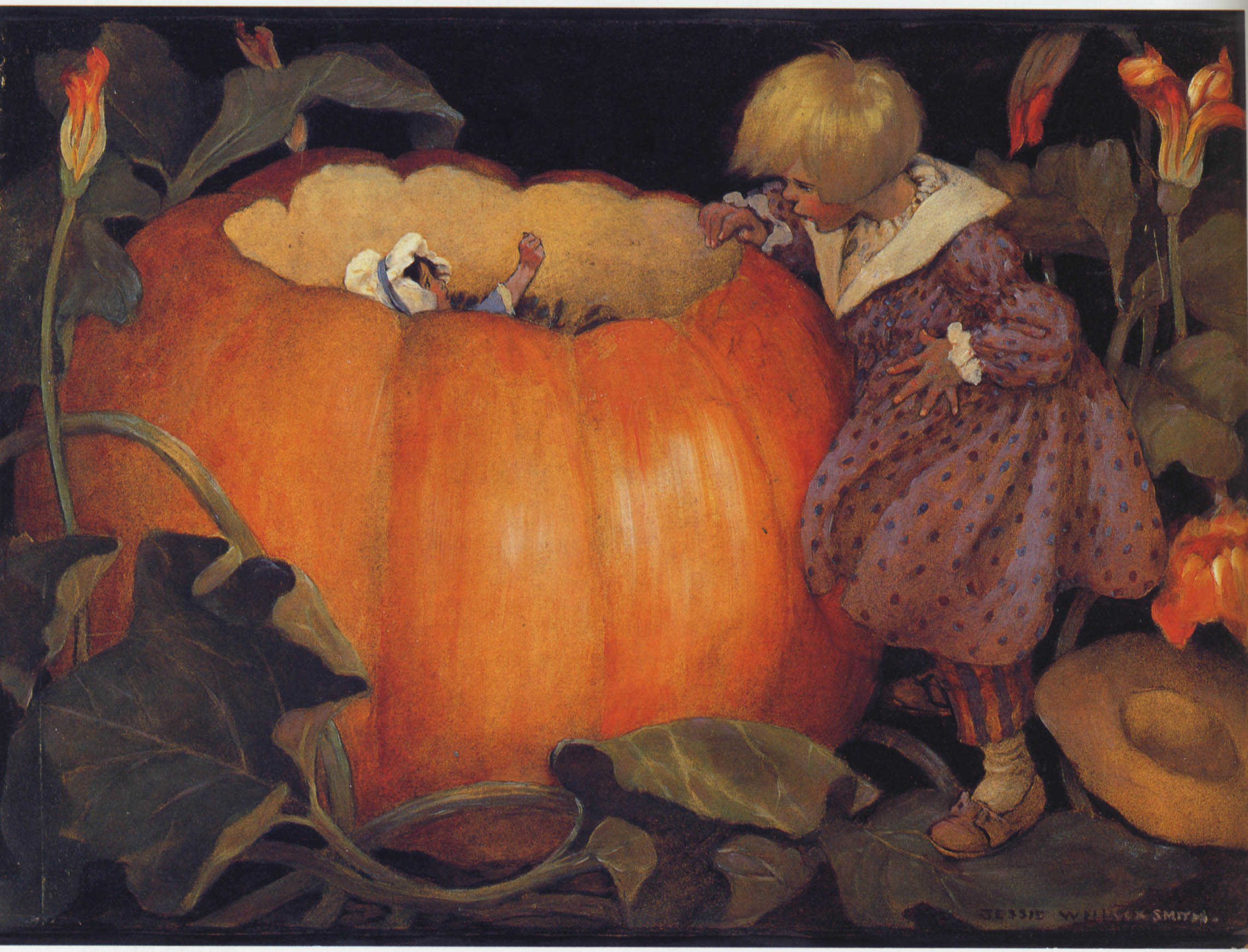
Jessie Willcox Smith (1863-1935), an American illustrator with fantastic technical ability. What strikes me about the work from this Golden Age is the haunting beauty, every image seems to carry a great emotional weight. In today’s world it even seems strange to think of them as being made specifically for children.
“Peter Peter Pumpkin-eater”Willcox Smith
Arthur Rackham (1867-1939), British artist. I’m fascinated by this artist’s work and plan to do a deeper dive into his life and art. His work was inspired by and in some ways represented a fusion between European, mainly Nordic folklore and artwork, and Japanese woodblock traditions. He combines expressive linework with thoughtful composition and stillness.
Rackham
One of my most read books as a child was the illustrated tomes of Beatrix Potter. I loved the delicate ink drawings with vivid descriptive details. The wonderful accuracy of the animal’s anatomy, the foliage and scenery reflecting Potter’s own love of the natural sciences.
Potter
Way back in the first exercise I wrote about reading A.A. Milne’s Winnie-the-Pooh as a child, having a beautiful hardbound edition replete with E.H. Shepard’s original illustrations. I think Shepard’s work provides a really poignant example for how children’s illustrations have changed over time. His simple yet evocative ink drawings have been replaced with highly polished modern redesigns.
Of course as a child I also read and reread Roald Dahl’s books over and over, and like many children I have a strong memory and fondness for Quentin Blake’s illustrations. It seems to me that while perhaps not the first, he was certainly one of the most vivid examples of, and influencers for, a new approach to children’s illustration that radically de-emphasized accuracy and polished linework. Blake’s illustrations seem to be emulating almost a child’s approach to drawing, but with the refinement and composition of an experienced artist. They’re noisy, exciting, he colours outside the lines and exaggerates features and expression. They’re outrageously silly and fun.
The BFG
You can see a through-line from this more modern approach to children’s illustration up to more recent works like the enormously successful The Gruffalo. Works that exaggerate and distort in ways that could be categorised as childlike.
By Axel Scheffler
I think what strikes my about contemporary children’s illustration, both from what I read growing up, and what I’ve been looking at in my research, is that there’s a much greater variety of styles present.
On of my favourite book series when I was a child was The Edge Chronicles. And while a recent revisit to the series unfortunately showed me that the writing doesn’t quite hold up to my childhood memories, the beautiful illustrations by Chris Riddell were every bit as detailed and impressive as I remembered. His work use very impressive linework, character design, caricature and strange fantasy landscapes. I remember at the time being struck by the technical detail that I felt was atypical of other children’s book illustrations.
Riddell
I think personally I connect more with the older illustrations, from the Golden Age, but I also understand that I’m not exactly the target audience for contemporary children’s illustrators! I also felt like trying to emulate those works would not fit with the brief, which asks me to research how trends have changed, and presumably how I should appeal to a modern audience. I’ve always been a bit of a chameleon when it comes to style, but I didn’t want to just try to copy Quentin Blake’s work either. So moving forward with my thumbnail sketches I tried to think of a way to draw in a way that I enjoy, while also trying to tailor the work to appeal to a younger audience.
I made the decision to introduce a character to the cover, trying to emphasise a feeling of adventure and to have an avatar for the audience to connect with. I went about drawing the mock-ups for three different cover ideas. I tried to vary my approaches.
I also settled on a 8″x 9″ format, noticing a trend of children’s books being more square than books for adults. The more squared shape also allowed me to experiment with different geometric compositions. I chose to fill in the book title myself, though in a final version my script would be replaced.
Firstly introducing a human dimension, showing a character involved in discovering the various animals in their native habitat. I tried to make it both funny and exciting. My worry with this design is that it might be too funny, maybe I went too far in my own direction by introducing a character and different comedic elements that the book publisher didn’t want. In all of the designs I wanted to emphasise a broad display of animals in different environments, which I think is really in keeping with the brief.
The second design is similar to the first, but with a more cartoony style and slightly different layout. It also places more emphasis on the animals rather than funny encounters with the character, who I’ve decided to keep in a prominent position.
The third design is more straightforward. I removed the character and went for a really simple idea, and I think this design is very successful.
Finally I used markers to create colour visuals.
One big takeaway from this exercise is to find a better way to do colour visuals! My posters from the previous exercise were impeded by non-waterproof pens and this time I found markers ill-suited to covering large areas in any reasonable time. The first cover I really feel like I botched, trying to roughly fill in background colours. In the future I’ll be sure to use the right tools, and do more digital colouring which I find pretty quick and useful.
For this exercise I need to make three museum posters, each targeting a different age bracket.
The first thing I did was the most straightforward, went outside and looked for museum posters. I didn’t find this super helpful, there wasn’t much on offer.
I felt like this was a good exercise to return to Pinterest, feeling like it would be a useful tool for this particular exercise. I wanted to find artwork in a fairly specific category and wasn’t too concerned about sourcing references or time periods, I just wanted a general impression to start thinking about how to approach my posters. So Pinterest was perfect. I made a board, and I’m happy with it. Some of the ones I found particularly valuable were the posters aimed at children, which I was having a bit of trouble thinking through in my head.
I paid a visit to my local museum. It’s a very small museum in a small town, but it is lovingly curated. It has a fairly wide array of artefacts from several time periods, which was great to see. I brought a camera and made sure the curators didn’t mind me snapping pictures! And I took a lot of reference photos. I did a couple of quick sketches and took down some impressions too.
This slideshow requires JavaScript.
My next goal was to categorise the material according to the age brackets required. I had a lot of trouble with this. I mean, children are not really a group associated with having a strong love of museums, so it was difficult to come up with a design for that group. Of course there’s an added layer of challenge in that I needed to make three posters, and the exercise specifically begs the question of whether the posters ought to be a cohesive set or not, and I supposed they should be. I thought about if I were to see a number of posters around town for the same museum, I feel like having three completely disparate designs would be a bad idea, even if they were overtly aiming at different audiences. I think a more successful campaign would follow a similar unifying format for all the posters. It would get people to associate this one motif with this one institution, and I think that would be the most convincing way to design these posters.
In the end I decided on my format. I wanted the main focus to be the museum artefact, and then a background illustration contextualising it. Finishing off the poster would be a caption and the museum information.
For the children’s poster I decided on a Stone Age arrowhead with an illustration of an archeologist involved in excavation. I chose this thinking that children are generally interested in digging in dirt and finding weird stuff, and also careers that involve fun easily recognisable outfits. Using this highly sophisticated market evaluation, I drew up my design.
For the teen poster, I went for something a little different. I chose an arrest warrant for Constance Markiewicz, an Irish revolutionary leader, socialist, suffragette, and general badass. My initial ideas were all targeted at teen boys, sort of violent, war stuff around the Vikings or IRA. But I figured given the current social and political climate, it might interest young girls to learn about a revolutionary hero in our country’s history who happened to be a woman. I understand the final design might not scream “teen” but I think it’s an outside-the-box idea and hopefully makes sense.
Finally for the poster for the general adult audience I chose a sword blade and an illustration of a Celt from the Iron Age. This one is a more straightforward choice, I think it’s a visually interesting artefact and from my experience Irish adults have a strong patriotic fascination with all things “Celtic”.
After doing line drawings for all the posters I did a quick wash over with watercolour to give an outline of what colours I would use for the final design. Well, I was almost positive that the fineliner I was using was waterproof, but apparently I was wrong… so there was a lot of bleeding and it prevented me from really developing the images with watercolour, which was a pity. Regardless, the basic idea comes through in the finished colour visuals. For the main colours in the posters I stuck to primary colours, and a good contrasting secondary colour to complement it.
So, in looking through the images again, I think it makes more sense to have the Celt poster be the one aimed at teens, being sort of simple and exciting, and the Markievicz poster to be the one aimed at adults, being more complex.
Finally I needed to complete a final rendition of at least one of the posters. I decided to finish the artwork digitally, and picked the Markievicz poster, it being the one that I think needed the most development.
I made some minor changes to the composition and experimented with a few textures and overlay layers. Overall I’m relatively happy with it, though I wonder if it reads more as “magazine cover” rather than “poster”. I think in the future when attempting posters I should aim to work as simply as possible to make them bold and readable from distance.
The first drawing I chose to revisit was the boot for the objective drawing. I chose this because I thought the boot is a relatively complex form, and it should be an interesting challenge to try to represent the shapes without just outlining the outer border, but rather to get a feel for the character of the shoe.
First I attempted it with my Pentel ink pen and regular graphite pencil. I used my drawing of the boot as my reference. I wasn’t very happy with the result. It looked messy rather than expressive, and still seemed very Western in approach.
I attempted the drawing a second time with the same materials. This time I set up the boot again and tried to draw from life. I was moderately happier with the result, but I felt it shared a lot of the same problems as the first attempt.
The second drawing I chose was the investigator from the exercise on choosing content. I wanted to choose a figure in order to attempt the style captured in my chosen reference image by Yoji Shinkawa, and I felt that this was the best character out of all of my finished artworks so far to do that.
Again using the brush pen and pencil, I found myself really struggling. Part of it is because the brush pen is very difficult to use well. The difference in pressure between a very thin line and a very thick line is extremely slight, and requires very steady hands and a lot of control. I love using the brush pen and it’s great for practise, but I feel like I seldom get good results with it! The final drawing still seems overly messy and concerned with shading and accurate representation. There isn’t that delicate presence of the artwork I shared in part one of this exercise post.
I tried the exercise one more time for each drawing. This time I worked at a bigger scale, A3, and used a long handle, relatively large round brush and a pot of sumi ink. Working with ink presents a unique challenge. Even compared to other water based mediums, it has a high degree of permanence, much more so than watercolour for example. Every brush stroke, even heavily diluted, is a large commitment. It also dries on the paper very deceptively, lightening considerably. But the permanence also makes it exciting and expressive, and the lightening allows for translucent layering. It has its own challenges, but I find it a very enjoyable medium.
I do feel like the results are a bit better. I definitely feel like these paintings have some merit. There’s sort of a deconstructed effect going on, and I think there’s at least a few areas where negative space is utilised well. But on the whole I still think they come up short. Nonetheless trying to approach a painting in a different way is a good exercise in lateral thinking and pretty entertaining too. I’m going to continue practising this style, even if nothing ever comes out of it I have fun doing it.