I decided to focus on traditional media for this exercise. I brainstormed which area I wanted to go with, and settled on ink. Specifically I wanted to look at more Eastern inking techniques, something that’s always interested me. I’ve felt that I’m sort of at a disadvantage when it comes to Eastern ink paintings, having not grown up familiar with the tools, or developed skills through years of writing their script which helps influence their brush movements and shapes and forms. Rather than imitate, I hope there’s a way to incorporate some of the visual quality of this art style that I love so much. I also find that personally I’m a very fast sketcher, so trying something that’s much more thoughtful and patient approach to drawing would benefit me. I received some feedback from my tutor that I maybe didn’t fully embrace the exercise on client visuals. So I thought that this was a chance to really experiment with reducing things down to their core components and evoking something greater than the sum of its parts.


The first artist who came to mind when thinking about this style is my beloved Yoji Shinkawa. He is a senior concept artist and mechanical designer who has worked in the video game industry for many years, most notably on the Metal Gear series. He’s one of my favourite artists. His work is so beautifully expressionistic but grounded in very accurate knowledge of anatomy. I would love for my own artwork to be described this way. Much of his work is drawn in negative, utilising empty space. It gives it this magical quality of almost being deconstructed art. I have a large artbook of his work for the Metal Gear series that I spent a lot of time looking over for this exercise. There were almost too many pieces to choose from, but here are a few I feel best representative of the work I wanted to take inspiration from.


I also came across a book called The Art of Sumi-E by Naomi Okamoto. It’s a detailed tutorial of how to do Japanese style brushwork and appreciating the aesthetic qualities of Japanese ink painting. In the book it uses a lot of sort of spiritual language and treats painting as almost a meditative practise. I also featured many beautiful illustrations and examples of how to represent some recurring motifs in the medium.


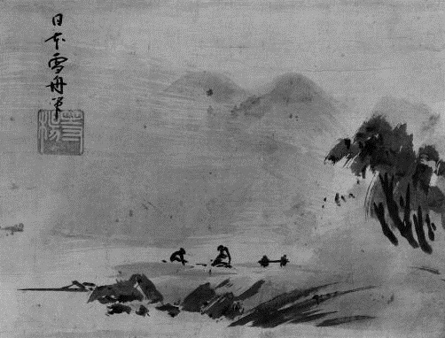
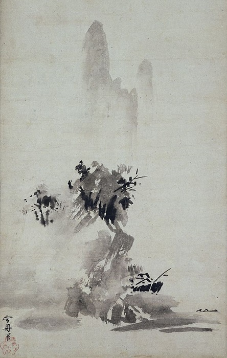
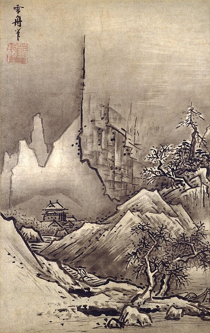
My favourite Japanese sumi-e artist is Sesshū Tōyō (1420-1506). I find it fascinating how his work compares to Western artists of the same period. Nearly contemporaneous with the finest Renaissance artists, his art obviously didn’t represent the same movement towards realism, detailed rendering, anatomical and mathematical knowledge. But it captures something beautiful and ephemeral in natural landscapes that’s difficult to put into words. As much as da Vinci was ahead of his time as a scientist, inventor and his contributions to realism; in Sesshū you can see the groundwork for the Impressionists.
Just to include a non-Japanese artist in the line-up, I also have huge respect for Scott Robertson. Author of the fantastic How to Draw, Scott is a brilliant mechanical and environmental design artist. His work is characterised by his highly accurate use of perspective. Sometimes he uses an ink brush for his mechanical drawings to add an exciting level of expressiveness. He posts videos on YouTube, and he has some very interesting and unique principles that he likes to bring to his artwork. The whole idea of permanence seems to be key. Purely as a way to encourage thoughtfulness and adaptiveness, he will use paper and media that makes it impossible to erase or alter. He advocates practising with an ink brush to improve control and hand-steadiness. It’s time-consuming and difficult, but I’d love to put more time into these drawing exercises to improve my own work.


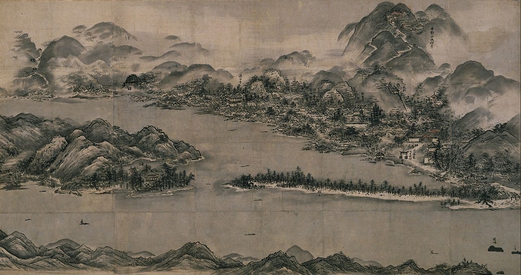
I wanted to do some more research and make an effort to discover artists I was less familiar with. I spent some more time researching and discovered more galleries by artists working in this style. Hasegawa Tohaku.

This beautiful landscape captures the idea of evoking something deeply with minimal, thoughtful representations.

Bada Shanren (1626-1705) was a Chinese painter who was an extremely influential practitioner of ink-wash painting. His designs are almost playful, simple yet evocative.

Yu-Ki Nishimoto is a contemporary Japanese artist working in the sumi-e style. His works are strikingly modern and emotional.
Of the artists I’ve researched, they can be loosely divided into classical sumi-e artists, contemporary artists and concept artists/illustrators. I don’t think it’s accurate to say that the style is defined as minimalist, as I sometimes see. When comparing and contrasting these different artists it’s clear that some are more detailed
while some are more simple

but I feel like the underlying commonality is more complex than mere reductivism. The white space in this style is used thoughtfully. It is not just unused drawing space, but a carefully considered active participant in the composition of the artwork.
I needed to choose one image that I most appreciated visually. I decided on this image by Yoji Shinkawa. I was required to describe the way that the illustrator works. In order to meet the brief, I first analysed the image in order to infer the illustrator’s process.
The image depicts a grizzled face, a soldier. There is a strong use of contrast and masterful use of negative space. The brush strokes are expressive and dynamic, as if the image burst onto the page in a few quick movements. There are few straight lines. The ink has been diluted in places, not necessarily for accurate shading, but for compositional impact. It looks like there’s a thick white fluid, correction fluid I think, that is used to add a final layer of contrast. The features are anatomically accurate but short of photorealistic. It effectively communicates the nature of the character. Angry but thoughtful.
Afterwards I spent a little time on YouTube looking for video of Shinkawa drawing.
The exact tool that he’s using here is a Pentel Pocket Brush Pen, something I own myself, and is one of my favourite things to draw with! It has a synthetic fibre brush head (not a felt “brush” tip but actual bristles) and a replaceable ink cartridge loaded inside. In combination he uses a regular graphite pencil and some kind of correction fluid. What really strikes me is that choosing where not to draw your lines seems to be nearly more important that choosing where to draw them.
Next I’ll carry on and do the drawings for the exercise.
References
China Museum Online. Zhu Da – Qing Dynasty. [online] Available at: http://www.chinaonlinemuseum.com/painting-zhu-da.php [Accessed 17 Nov 2018]
Jamieson, A. (2018) Hasegawa Tohaku: The Timeless Giant of Japanese Art. [online] Japan Objects. Available at: https://japanobjects.com/features/hasegawa-tohaku [Accessed 17 Nov 2018]
Okamoto, N. (2015) The Art of Sumi-E: Beautiful Ink Painting using Japanese Brushwork. UK: Search Press.
Robertson, S. (2013) How to Draw: Drawing and Sketching Objects and Environments from your Imagination. China: Design Studio Press.
Shinkawa, Y. (2018) The Art of Metal Gear Solid I-IV. China: Dark Horse.


![[This one]](https://joshrobbinsoca.home.blog/wp-content/uploads/2018/11/dracula03.jpg?w=196)